Designing the Playar Alpha App
June 20, 2025
When we started designing and mapping out the initial experience for Playar's alpha app, which would essentially be the 0.1 version — a first draft. This early stage meant we would progressively gain clearer understanding into how the app should work, what functionalities it should include, and how to make it delightful and engaging for users.
The design approach was threefold:
- Keeping the UI Simple: A simple and straightforward UI allowed us to test essential functionalities with minimal effort, laying a foundation for later enhancements based on user feedback.
- Prototype Early: Our aim was to not only evaluate how things looked but also how they would feel. Early prototyping provided coaches with tangible interactions, enabling them to give meaningful feedback.
- Gather Feedback and Iterate Quickly: We prioritized obtaining quick and frequent feedback — even from partially developed versions. This iterative process ensured we continuously identified areas for improvement.
The input we received from coaches significantly shaped the direction of our app. Coaches expressed a need to compare student performances, access detailed student-specific statistics and understand macro-level performance trends such as averages. These inputs directly influenced the design priorities and functionalities we implemented.
Core Functions
Based on these inputs, we were able to narrow down the core functionalities for the alpha version of the app:
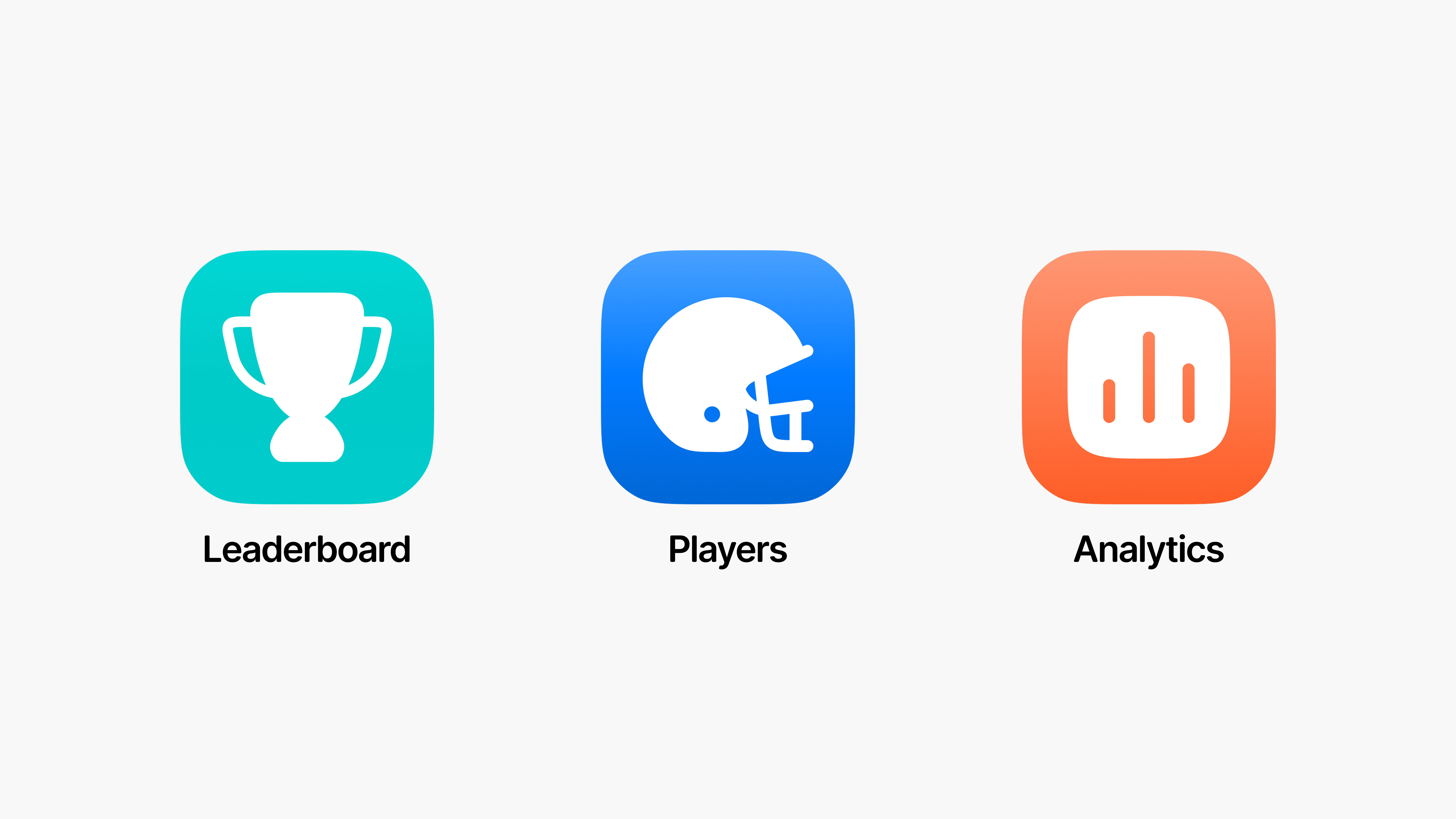
- Leaderboard: Enables coaches to compare and rank player performances, incorporating an element of gamification to enhance engagement.
- Player View: Provides detailed player profiles, offering in-depth statistics and analytics tailored to each individual.
- Analytics: Offers a high-level view of overall performance trends, including charts and averages, to help coaches quickly identify patterns and make informed decisions.

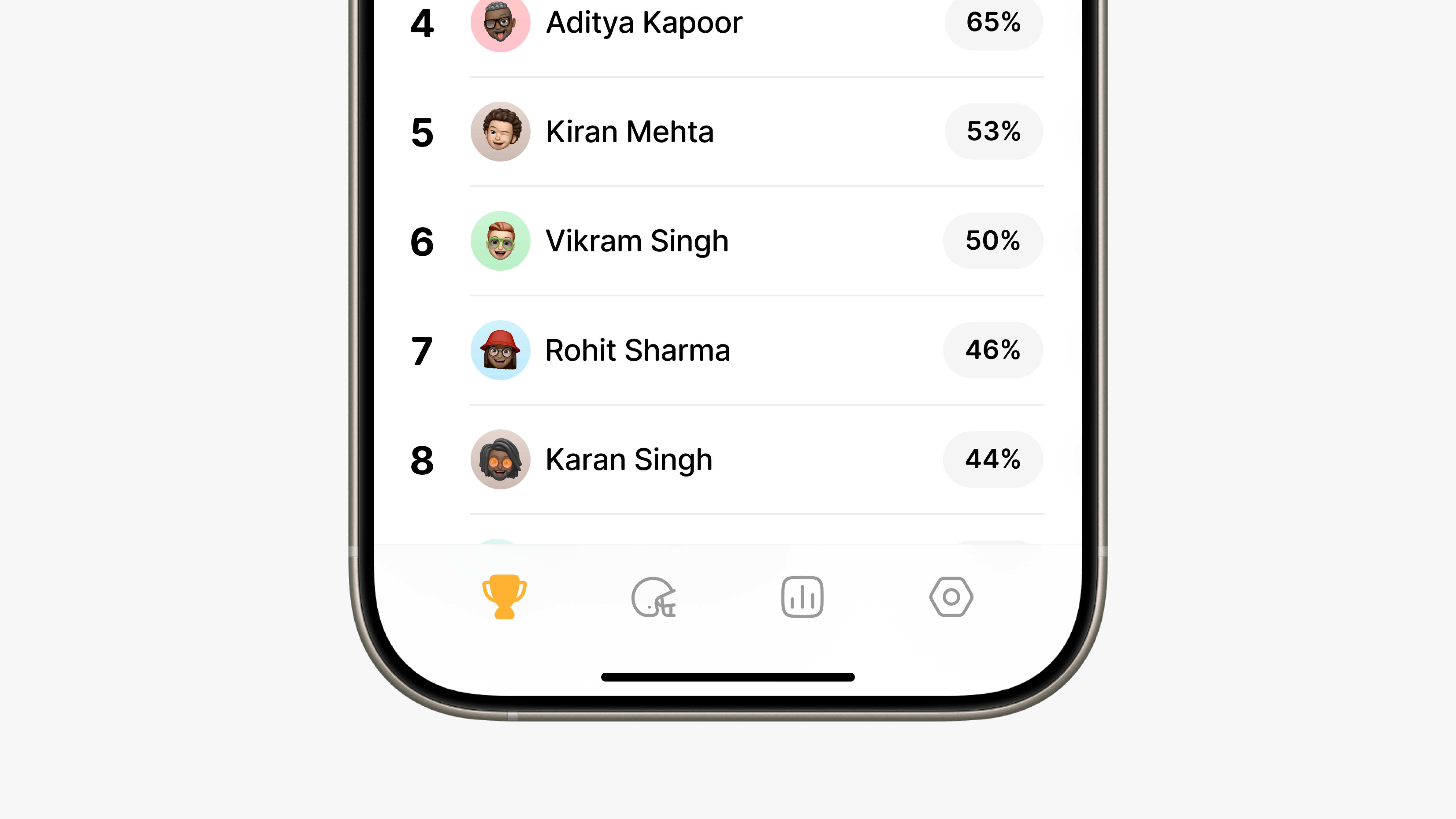
These core functionalities transitioned into the app's tab bar, accompanied by a Settings tab. This structure addressed users immediate questions: "What does this app do, and what can I achieve using it?"

During our design process, we continually revisited several important questions to guide our decisions:
- How should we approach this?
- Should we gamify the app and give it a playful feel?
- Would a serious aesthetic better resonate with coaches and players alike?
- What is the ultimate goal of the app?
- Who are our primary users?
- How clearly does the app inform users about what they are seeing and how they can interact with it?
As we explored these questions, we aimed to strike a careful balance, ensuring the design would resonate well with our users.
Design Approach
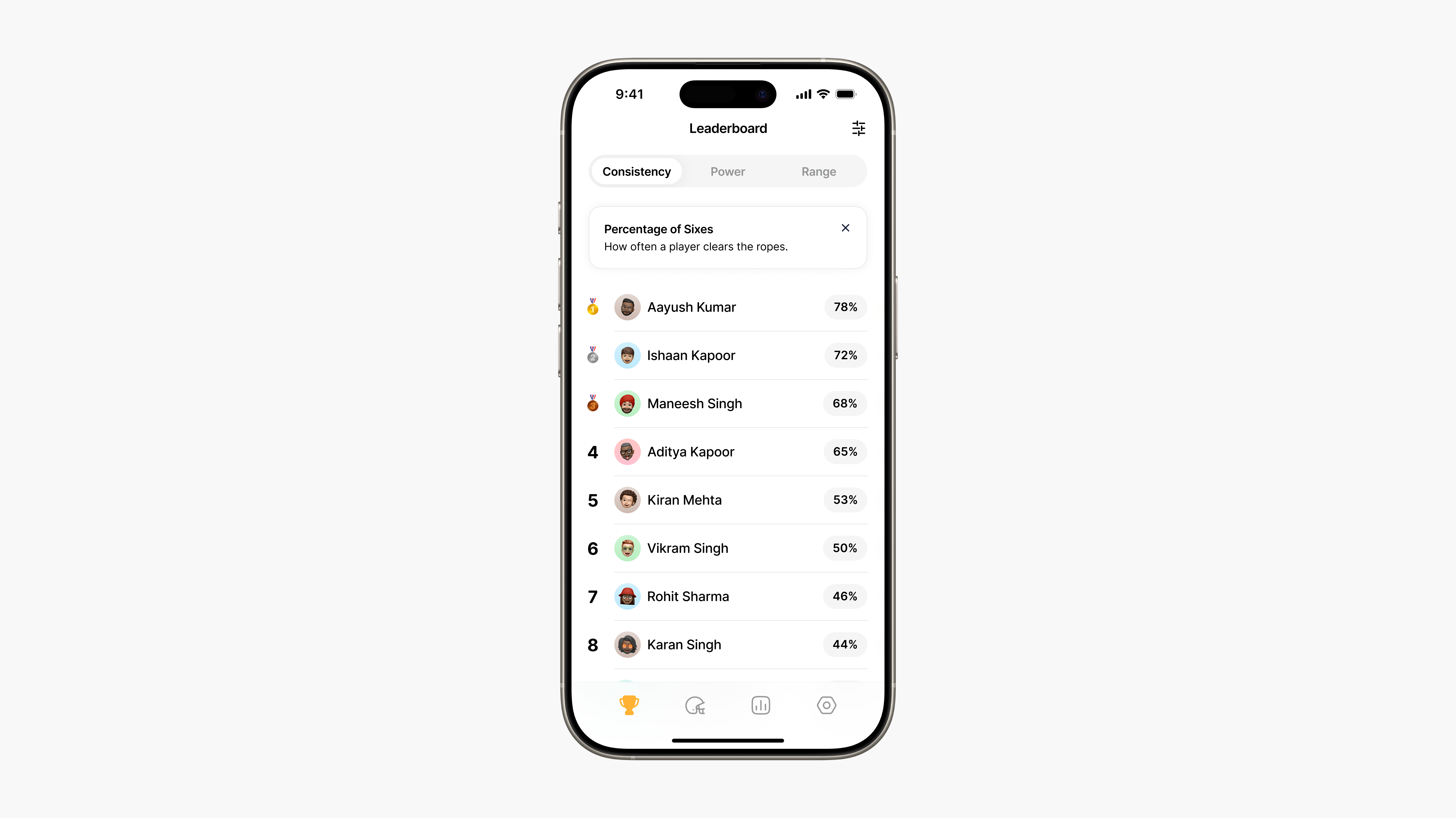
We started with the leaderboard because it immediately communicates value to coaches.
When a coach logs in, the leaderboard answers two core needs:
- Performance Comparison: Coaches can quickly see who is excelling, who needs support, and by what margin.
- Focused Metrics: In this alpha, we concentrated on three critical categories — consistency, power, and range, to keep the interface clear and meaningful.
Some design considerations included:
- Metric Definitions: Clearly labeling each category so coaches instantly understand what consistency, power, and range represent.
- Age Group Categorization: Organizing players into age brackets to ensure fair comparisons and relevant context.
- Visual Visibility: Displaying raw metric values and visual indicators for at-a-glance comprehension.
By addressing these questions in the leaderboard design, we ensured coaches could dive straight into insights without confusion, setting a strong foundation for the rest of the app.
